Electoral analysis in general takes "the polls" and then usually adds "an algorithm" or other information (often economic data) and tries to see how the current state will play out. Electoral-Vote.com is one of these--although his "method" is more just a sample of state polls, averaged if they come out the same day, and weighted by the state's electoral college vote. He originally did it three ways:
- All polls averaged and published.
- Only polls with non-partisan affiliation (and only when the polling firm itself copped to having a partisan affiliation) and averaged over three days.
- Polling with an algorithm to determine undecided voters.
In 2004, #2 performed the best. I think that's what he uses now (so it's not so much an algorithm as throwing out national polls and looking only at state polling. NOTE: state polling can be spotty for a lot of states so I'm not sure how that factors).
His current state of play looks like this (NOTE: this is anothercool thing he does--provide "icons for bloggers" so the image you see below is real-time and updated). This, so far as I know, is an almost unique feature!
The 2004 Campaign
So we're going to start with Electoral-Vote.com's best feature: their polling trend-lines with commentary.This is brilliant: it shows the "poll of polls" (both with electoral-state ties and without--we'll look a 'with') to show how the compiled list of polls (which is more accurate over time than any single poll) trended during the 2004 Kerry-v-Bush campaign. It looks like this:
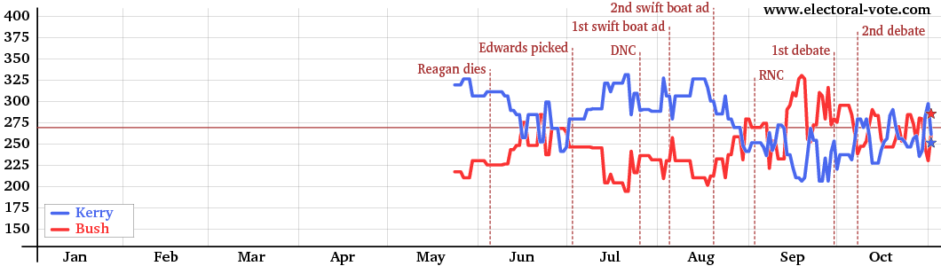 |
| Right Now We're in August. See How Kerry Was Ahead? |
However, this is an excellent view of the election and it's an important one--and another thing almost unique to Electoral-Vote.com. Lots of sites show you the poll-of-polls graph. EV.com gives you an extra value-ad.
In the case of Bush-v-Kerry we can see it was pretty give-and-take from September on (late Aug, really) and, at the end, there was big shift right at the finish line. Reagan-vs-Carter did the same thing.
The 2008 Campaign
On the other hand, 2008 shows a break-away in late September and it never comes back close.
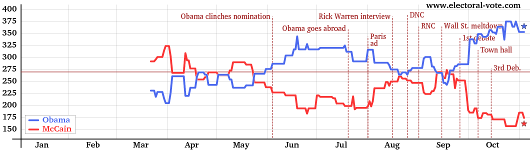 |
| A Lot of Blogs Claimed McCain Was Winning In The End ... |
The site's electoral vote prediction for the 2008 election was very close to the actual outcome, correctly projecting the winner of every state except for Indiana, and showing Missouri (won by John McCain by only 0.13% of the vote) as a pure tossup.[6] The Senate projection was also close to the actual outcome, predicting 34 of the 35 decided states correctly, including correctly showing a Democratic pickup in Alaska and incorrectly showing the Republican Senator Norm Coleman holding his seat in Minnesota.[7] The Senate results of the Minnesota election was so close that it was contested until the state supreme court ruled in favor of Al Franken on June 30, 2009.The 2012 Campaign
So where are we now? Here:
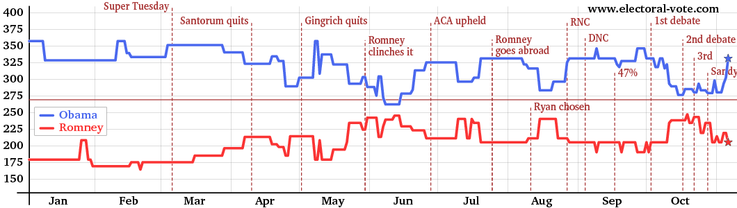 |
| Lot of Sites Claim Romney Is Ahead In Polling |
The Net-Net
It's important to remember that the guy who runs the site, Andrew Tanenbaum, is a member of Democrats Abroad and apparently leans a bit libertarian. However, he makes sure to show his work (you can download all the numbers and check it yourself) and he's not adding any "secret sauce" that I can see anyway. The only question would be about percentages that a given state will break for one side or the other and that's probably not subject to bias either (I assume it's a margin of error calculation).
A Few More Things
Electoral-Vote.com is pretty "bare bones" when it comes to methodology. It's accurate because polling aggregates seem to be accurate and it's value added because his site keeps current and produces enhanced output like the events and the blogger icons (which is not all that valuable to most readers--but is great for me as a blogger!). In other words, it's a class act. He also provides good commentary and links to interesting topical articles.
But what really sways me is those event lines. I've often looked at polling trends and tried to go back and figure out "What was going on then!? What was going on just before then? What was the polling cycle that displayed that change?" His graphs really help with that and they bring up another major development in electoral science. This is taken from the TwinDex: Twitter's big-data election play.
 |
| Full-Frontal Election Porn |
This shows a graph of how twitter traffic spiked as the Ryan pick leaked / broke. This is just a view of the traffic but Twitter has much deeper pockets than they're showing here (they can break down, roughly, by positive or negative traffic and so on).
While there is simply no way a site like Electoral-Vote.com can do this (they don't have access to Twitter's "fire-hose") when this kind of material is combined with a state-by-state polling analysis like EV.com's we might be able to peek inside the black-box and actually see not just correlation but, maybe, causation for the fluctuations in polling.
That would change electoral science forever.
No comments:
Post a Comment